Showing posts with label Processing. Show all posts

Wednesday, July 3, 2013

Image Processing ~ Where to begin?? When to stop??


This is the final result I achieved....or where I was satisfied with the "look" of the image.
Lately I have been tutoring a couple photographers on image processing...both on the iPhone and in Photoshop. One of the questions I get repeatedly is: "How do you know what you want to do with an image?" What a great question!!! The answer however is sometimes elusive.....but hopefully this post will give a little more insight into answering the question....at least on this one iPhone image I played with yesterday.

Part of thinking about processing actually begins in the field for me. I spotted my neighbors Datura blooming in the morning and after running some errands I went back to get a few shots...well guess what I was too late. The blooms had wilted and only a few budding blossoms were left. I had the OlloClip with me and as I always do I asked myself what I loved about my subject? Well I loved the curl and folds of the blossom end..so I used the macro lens on the OlloClip, knowing I probably would not get a totally sharp shot because I had to hold the bloom up while making the image. I made several shots and landed on the one below to start my processing. I chose the app 6x6 for its clarity and square format..as well as its ability to delivery a tiff file with a 300 dpi resolution. Once I have a shot I ask myself, "What do I think needs to be done with this image?" My answers were....
I would like to get rid of the green corner in the upper left and I would like to get rid of the brown area in the lower right....I like to take care of spots before I begin any process.
So in iPhone land my go to App for removing or adding in areas of correction is Touch-Retouch. Below is the resulting image after using Touch Retouch to make those initial adjustments, using the brush, lasso and clone stamp I was able to acceptably make those adjustments.

Now I asked myself "What I thought the image needed, to enhance "what I loved" about the subject.
So because my answer was the curls of the bloom, I thought they needed more definition by increasing the depth and light of the curls and maybe a little more color...so I then went to Snapseed and added Ambiance, adjusted White Balance, added a little sharpening and some structure and saved that file. With just a few adjustments it was beginning to fit my "vision" of the image I had in mind when I captured it. I was not sure about the little triangular peek of my blue jeans in the bottom center of the image but I decided to leave it there for the moment.
My next thought was to further define the furls of the blossom by running the image through Tangled FX adjusting the filters there to get the look I wanted to use as a "blend" file with the now adjusted Snapseed-Touch Retouch file. I landed on this image from the App Tangled FX because it maintained the softness and added a glow to the image I wanted to convey. Now it was time to blend this back with the Snapseed-Touch-Retouch adjusted image...so I used ImageBlender to make the blend.
 The result of blending the two images is the image below.
Now I wanted to run it through Glaze to get a painterly effect (did I mention I love painterly effects? and Glaze?)....so I made many iterations in Glaze and several blends in ImageBlender...that stayed true to my intent, to enhance the furls of the blossom..
After making several blends with ImageBlender and Glaze I landed on the result below as my final blend. I also went back into Snapseed and used the Selective adjustment feature to enhance the color and brightness in the center of the blossom, as I thought it needed attention drawn to it...Because when I asked myself in the field what I loved the answer was the blossom folds so I continued to work toward enhancing what I loved about the subject. Now at this point, I knew I did not want to keep that peep of blue in the lower center of the image..so I went back to ImageBlender and used this image twice, arranged and masked out pieces to fill in the blue area as desired.
The last question I asked was how about a little border...so I went into PhotoToaster and added a very subtle border to frame the image and considered it done!
Below is a screen shot of the files I made on my iPhone during the process of getting to the "Final Image."  So what do you think???
My next all day iPhone workshop is July 13, in Chesapeake City, Md at Horizon Photography Workshops...Click here for more info and registration.


Saturday, October 8, 2011

Gates: Putting them together: Many Apps

This is a BracketMode shot for the highlights made on a tripod

This is the BracketMode shot for the dark areas of the image.
Today I had a request to try and breakdown how I processed the gates image above..so here are the steps I took, the apps I used, and the images I used. The initial working images were shot at Second Chance an architectural reclamation warehouse while I was conducting my HDR workshop for DSLR shooters.
After making the initial shots above in BracketMode, I blended the two images in TrueHDR, adjusting warmth, brightness and saturation, and arrived at the image below.
Then I decided I wanted the image in Black and White so I used the app Simply Black and white to make the conversion, adding a subtle black vignette and applying an orange filter option, arrived at the image below.
I wanted a slightly different toning to the gates and opened the image in Bleach Bypass and selected the tone option Verve adjusting the slider until I had the tone I wanted below.
Then I was goofing around with this last image and said I wonder what this would look like run through Tiny Planet...so I did...and came up with these two images.

 Then I said hmm...what can I do to these that might be cool? And I opened the last one in BadCamera added a frame and some effects and came up with this image.
Now that I had this image from Tiny Planet, I said..how can I blend these together??? So I opened SuperImpose...and used the "Verve" gates file as the background image...and added the BadCamera file above as the top image, transforming the top image by shrinking the file and rotating it 45 degrees to the right then adding a yellowish color to the foreground rotated image, adjusting for exposure, brightness and saturation. Then while in SuperImpose I added one more foreground image of the gate and stretched it out over the last two files after reducing the opacity to cover the barren area of the bricks and the foreground.
My next step while in SuperImpose was to add a file I shot of a stained glass window to these layers stretching out the file and reducing the opacity leaving only a trace of this file.

 After saving the layered file from SuperImpose, I opened that file in Simply HDR and chose a High Dynamic range preset tab "SubtleHDR", committed that render and then tapped the adjust tab while still in SimplyHDR, and chose a tint option containing purple and reduced the opacity to get the enhanced color effect in the image.

Then I ran that image into PerfectPhoto sharpened and then into SnapSeed for the ragged edge border below and lastly ran that image into Crop'n'Frame to finish it off. Now you know how my mind works! At least on this shot...

The final resolution on the file is 1400 x 1809, so it lost some file size going through these iterations. The original file size was 2592 x 1936.

Monday, January 24, 2011

Image Processing wih the iPhone

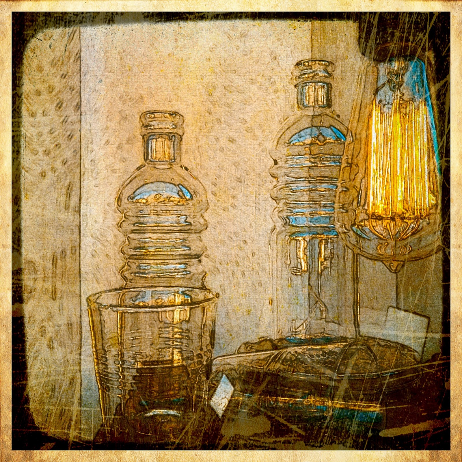
I was working with a client when she pointed to this neat light bulb in a shop window, and I said oh yes that's a picture, and we both made some images.  The first image in this series is the shot I made right out of the iPhone (I was about to say camera) It was captured with the Camera App CP Pro.


I started to work with it by first running it through the app called Artista Sketch as I wanted more definition to the glass objects and got this image.
 I wanted more of the image to show through so I decided to take this image and the original and make some layers in the app called Iris. This is the first layer.

I also applied some effects in a film style app called Film Lab with a vintage setting and achieved this image.


I applied a special frame called Viewfinder in an app called Camera+ to crop and focus the eye in the frame. I also took the image into an app called Perfect Photo to sharpen and added some light bloom.
Then I went to the PicGrunger app and added the border and some scratched effects with Studio style there to achieve this look.


Then I added the border and frame in a new app called Crop'n"Frame
and finished it by adding my signature in an app called Impression.

While this process worked well with this image, it may not be a universal formula for processing images as I find that like in Photoshop, each image requires certain effects and processes and it is hard to make a formulaic approach.